April 28, 2010

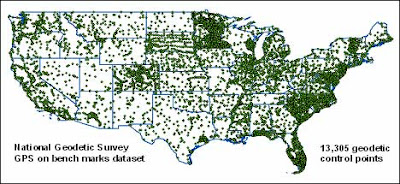
Favorite Map 3: National Elevation Dataset Benchmarks

Figure 4. A dot map of 13,305 National Geodetic Survey benchmarks across the continental United States. Each benchmark has an associated high-precision GPS unit used to calibrate and reference the USGS’s National Elevation Dataset of DEM’s.


This week, I was searching for DEM’s in another class and came across this map on the USGS’s website. I didn't know how much effort and equipment the USGS uses to calibrate its DEM's. Apparently, accurate elevation datasets are only necessary in highly populated areas; sparsely populated regions have few GPS benchmarks.

Child population under 5 years old vs. Mean family size in Buffalo, New York

Figure 3. A bivariate map (proportional and choropleth map) displaying the (raw) child population under 5 years old and mean family size for census tracts in Buffalo, New York, U.S.A. For this map, symbol size was optimized, allowing the smallest symbols to be visible while minimizing excessive coalescence. White outlines were used to differentiate overlapping symbols. Psychological scaling was used.


Although I expected larger families to have more young children, no definitive trend occurs between child population and average family size. Census tracts with a large average family size had (both) large and small populations of young children.

Population of Worldwide Capital Cities

Figure 2. Graduated symbol map showing worldwide capital cities as viewed from 45° N latitude and 0° longitude. Only cities with a population larger than 750,000 are displayed. For this map, symbol size was optimized, allowing the smallest symbols to be visible while minimizing excessive coalescence. White outlines were used to differentiate overlapping symbols.


Cropland Distribution in Idaho

Figure 1. Dot map representing the cropland distribution in Idaho. [Cropland data is at the county spatial level.] For this map, dot size and dot value were optimized, preventing the data from appearing overly accurate or insignificant. Furthermore, the dots were allowed to coalesce, indicating the counties with large cropland acreages. In this case, the general guideline for choosing an appropriate dot was inappropriate, given the large data range [0-378,150] and extremely small dot value suggestion [1 dot = 800 acres].


April 14, 2010

Favorite Map 2: Lake Pend Oreille Navigation Map

Figure 1. A navigation map for boating, fishing, or recreating on Lake Pend Oreille. This map includes depth, obstacle, and localized declination readings necessary to safely navigate the lake. In addition, the map provides general reference information for the area surrounding the lake, including town, road, rail, and contour information. Most of the map credits are missing, so an exact projection and scale are unavailable; however, the geographic coordinate system is listed as NAD83.

My family has a paper copy of this map, and I have had the opportunity to use it while boating the lake.

Figure 2. Photo of the Clark Fork River delta last summer.

Annual Precipitation in Idaho


Figure 1. The distribution of annual precipitation in Idaho. The isohyets and underlying raster layer were interpolated from weather station data using the Inverse Distance Weighting (IDW) method. The optimal IDW “k” value (3.191) was computed using the ArcGIS cross validation tool. Although the precipitation raster could have been classified and displayed as a choropleth map, more localized variation and relative differences between other interpolation methods can be observed when using a full-spectrum color ramp. In addition, homogeneous precipitation regions are difficult to discern when using a single-hue color ramp, further justifying the multi-hue color scheme.


Figure 2. The distribution of annual precipitation in Idaho. The isohyets and underlying raster layer were interpolated from weather station data using the Kriging interpolation method. The Kriging operation was performed using a lag size of 38,884 and lag number of 12, yielding an RMSE of 3.523 with an exponential mathematical model. Although the precipitation raster could have been classified and displayed as a choropleth map, more localized variation and relative differences between other interpolation methods can be observed when using a full spectrum color ramp. In addition, homogeneous precipitation regions are difficult to discern when using a single-hue color ramp, further justifying the multi-hue color scheme.