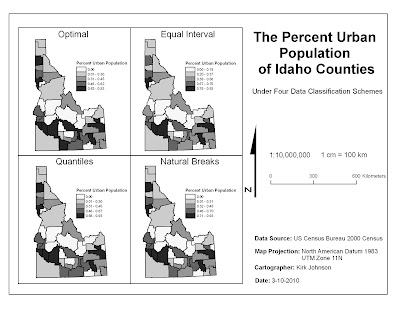
Figure 11. The original Lab 3 data classification map applying four data classification schemes to the percent urban population of Idaho counties.

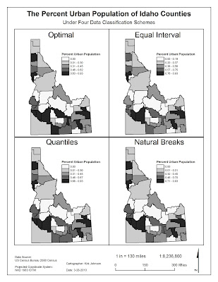
Figure 12. The revised Lab 3 data classification map applying four data classification schemes to the percent urban population of Idaho counties.
For the map revision, the visual hierarchy scheme was applied to correct deficiencies in the original map layout. To shift focus away from certain map items, the title was limited to one line, the north arrow was made less prominent, and bold text was removed from the credits. Smaller text was also used for the title and credits. To increase the prominence of specific map items, a larger map scale was applied, increasing the mapped area’s size and drawing more attention to the mapped area. Finally, the legend, credits, north arrow, bar scale, and written scale were rearranged to fill “white space” and create a “balanced” map.
Non-hierarchical items were also modified during the map revision. First, the map’s orientation was changed to better suit the mapped area’s dimensions. Second, the map units were converted to inches and miles, given the high likelihood of an American audience. Finally, the map’s projection was changed to the Idaho Transverse Mercator; this map projection accurately projects the entire state of Idaho while UTM Zone 11 does not accurately represent Southeastern Idaho.
No comments:
Post a Comment